TakeNotesCase study Landing page
Case study · Interaction design

TakeNotes

A notebook that tests you on what you wrote.

An iPad notebook for students. Mark what matters while you write, and it comes back as a question before you forget it.

Role
Solo product designer
Scope
Research, UX, UI, a native iPad app and its landing page
Platform
iPad, iPadOS 17 or later
Status
In TestFlight beta, 13 testers
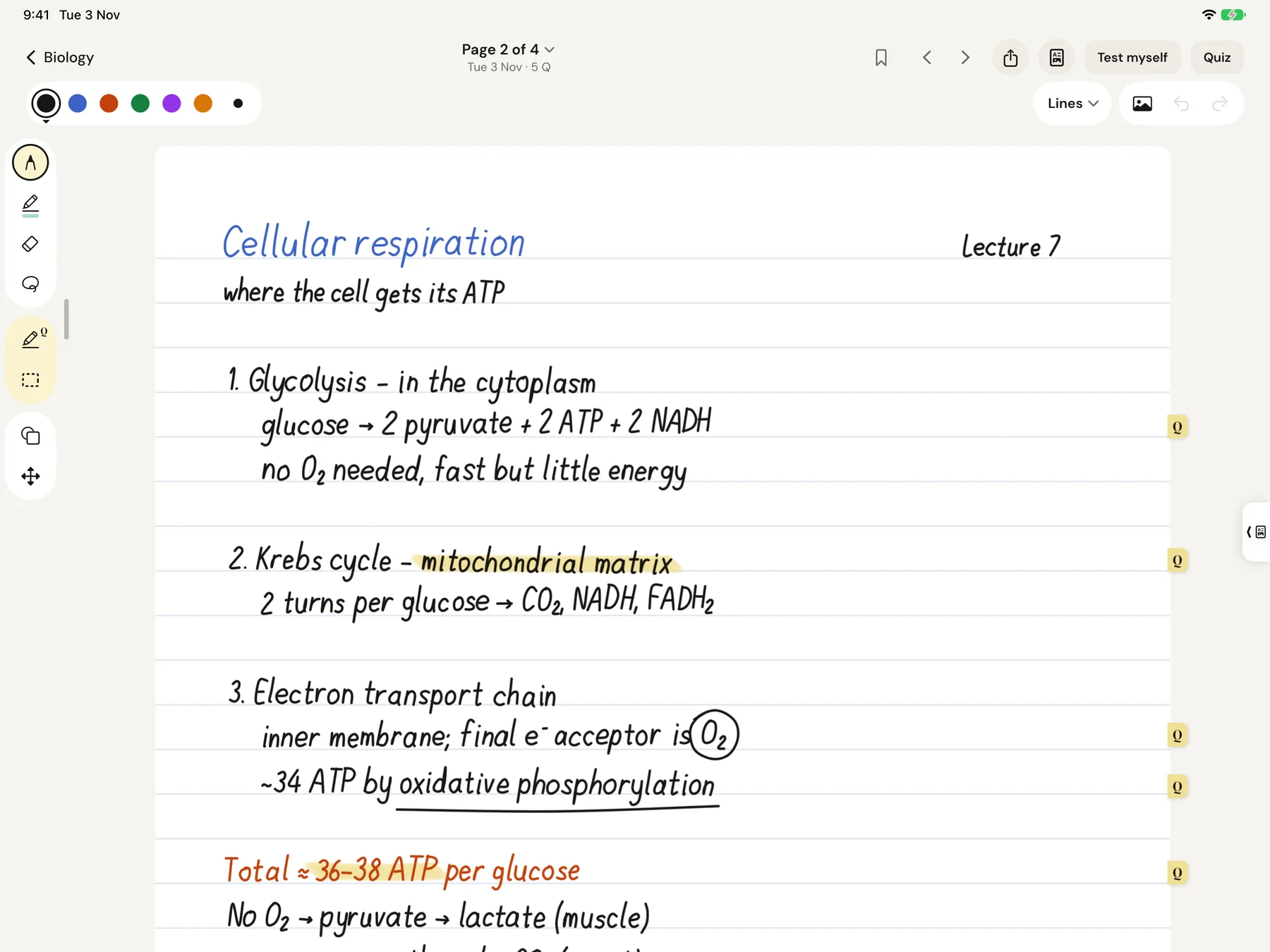
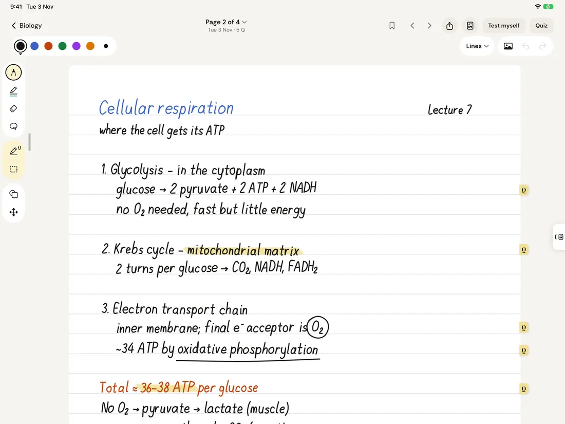
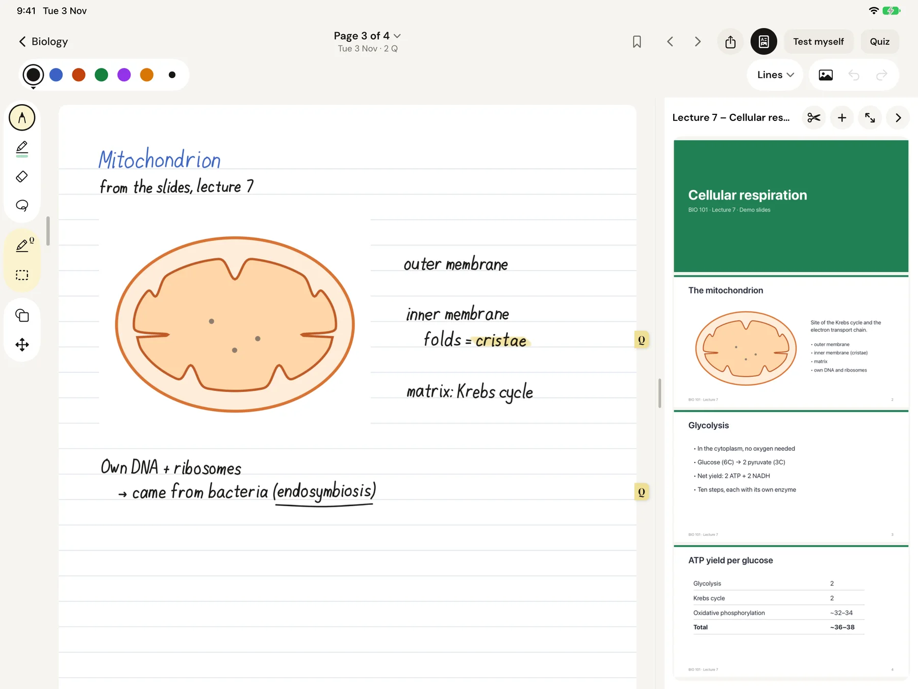
A TakeNotes page about cellular respiration with five parts marked as questions and Q tabs on the page edge.

My role. Solo product designer. I used Claude for research, checking and process automation, and to write the code. Every design and technical decision, every test and every change was mine; AI helped me carry them out.

01 · The idea

I was learning the app instead of the subject I came to study.

As a student I tried many digital notebooks, and each one took time to figure out. After a while I'd realise I wasn't studying: I was learning the app's features. So I went back to paper, where everything was in front of me and I could mark what mattered and bookmark what I needed.

Not long ago some friends of mine started university, and the question came up again. What I didn't make for myself back then, I decided to make for the students who come after me.

The principle

Don't get pulled away from studying.

Everything you need is in front of you from the first time you open it. Pages run as one continuous strip, with an empty page always waiting below. There is no "next page" button: a student in a lecture shouldn't be distracted by extra controls.

02 · Understanding the problem

What works for memory, not what a few people prefer.

I built TakeNotes on published research. Twelve university studies give exact numbers on which study methods work; a handful of interviews would have told me what a few people prefer. I also had my own years as a student, and friends who just started university: many struggle with revision, and not everyone knows how to study well.

  • Real12 published studies; a market scan of Goodnotes, Notability, Quizlet and Anki.
  • My ownMy years as a student; conversations with friends who just started university. Informal, not recorded.
  • AI-simulatedThree proto-personas built from the studies; a usability test with 8 simulated testers.

Three findings, and what each one changed

Real

Testing yourself beats rereading.

Finding
A week later, students who tested themselves remembered 61%; students who reread, 40%. Most test themselves late, only to check.
So
The notebook has to ask the questions, and keep asking.
Decision
Whatever you mark becomes a question, and comes back when you're closest to forgetting it.
Real

Students study around deadlines.

Finding
66% cram the night before a test; only 13% plan ahead.
So
Use the date they already care about.
Decision
Add an exam date, and the app spreads the questions you're unsure about over the days left.
Real

A highlight alone doesn't help you remember.

Finding
Highlighting and rereading are rated low-utility; practice testing, high.
So
What you mark should become something you're tested on.
Decision
Test myself covers every marked part of a page; you write the answer on top, then tap to check.

Sources: Roediger & Karpicke 2006 · Hartwig & Dunlosky 2012 · Dunlosky et al. 2013.

03 · Finding the interaction

How "this matters" became a question.

Three sizes of "this matters".

Every student underlines differently and marks different things. So I made a scale: small, underline or circle with the pen; bigger, for whole sentences or lines, the question marker; largest, a dashed box that turns a whole block into one question. You use one tool all the time, or switch as you go.

Pen underlines ran into technical problems in the prototype. They were solved in the real app, where the recognisers were tested on strokes recorded from my iPad: 22 of 22, 9 of 9 and 7 of 7 marks found on three pages. One writer, a few pages: a good sign, not statistics.


A highlight isn't always a question.

In real lectures, many students highlighted the topic title just to see where the next topic starts. I do the same. So I kept the question marker and added a real highlighter, in a separate group of the tool column, so it's clear which tool does what. The toolbar took more rounds than anything else in the app.

An experiment in directing

On my earlier projects I designed everything by hand in Figma, then gave it to Claude as the reference to follow. This time I asked: what if I only direct? Most design decisions here were made through words. I described what I wanted, Claude built it, I reviewed and corrected. I went back to designing by hand only for the landing page.

I decided and directed

The vision, every decision, every review, all tests on the iPad.

Claude produced

Research drafts, the Figma screens and design system, the code of the prototype and the app.

I designed by hand

The landing page pass in Figma.

  • The first hero zoomed into a screenshot: very pixelated. I asked for a blank sheet that writes itself instead; the handwriting now draws from the real vector strokes.
  • The drawn iPad was ugly, to put it mildly. I insisted on Apple's real product bezels.
  • Illustrations ran into the text. The page had more lines than my Figma: the text blocks were wider than designed.
04 · The product in motion

Mark it. It comes back.
Right before the exam.

The web prototype I tested on my iPad before the native app; nothing is saved. Open it full screen.

One decision per screen

Notebook page with marked questions.
PageThe marker, the dashed box and the pen all make questions; a Q tab on the edge shows what's in.
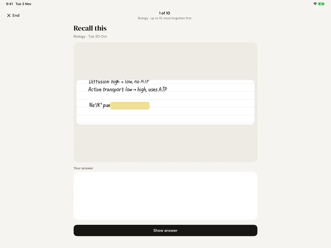
Quiz card with the answer covered.
QuizYour own page with the answer covered, and room to write before you reveal.
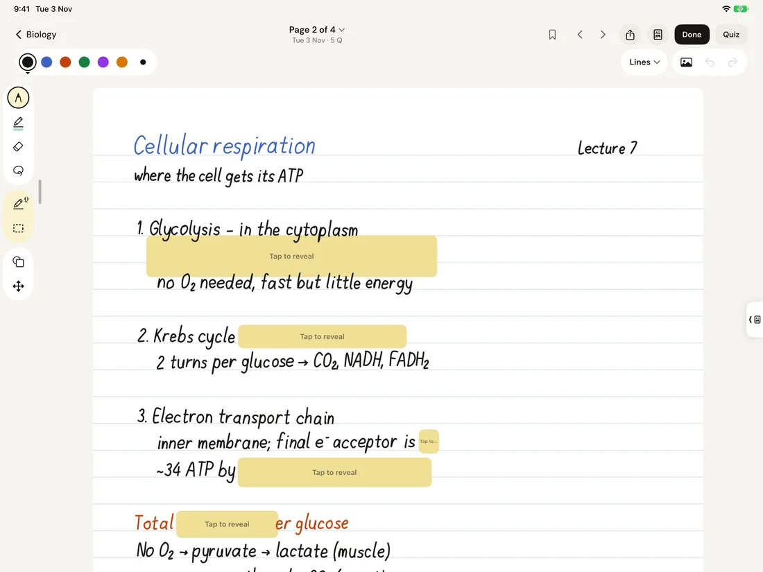
Test myself: covers over every question on a page.
Test myselfCovers every question on the page at once.
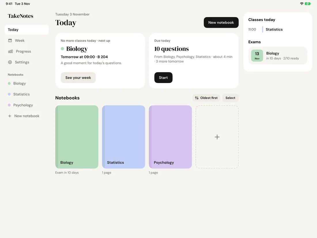
Today: next class, questions due, exams.
TodayNext class, questions due today and the exam countdown on one screen.
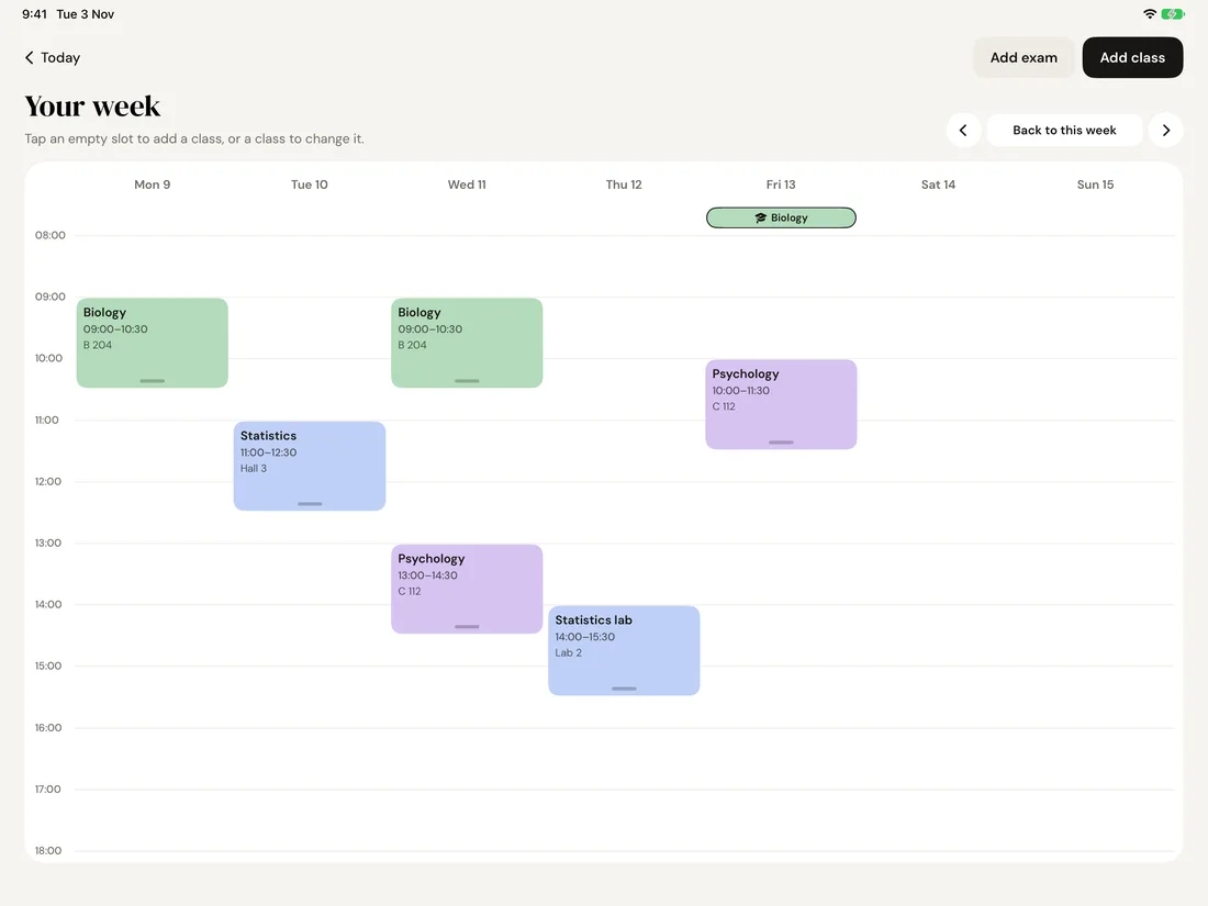
The week with classes and an exam.
WeekSet your classes once; move one week or every week.
Lecture slides beside the page.
PDF beside the pageSlides next to your notes; cut any part of a slide into a question.

Native app, iPad simulator, demo content.

05 · Testing and iteration

Four kinds of checks, kept apart.

They are worth different things, so I never mixed them.

  • My ownSix rounds of testing the web prototype on my iPad, then every native build.
  • Real peopleFriends used the web prototype; three TestFlight testers sent feedback, two of them after writing real lectures with it. No counts, no recordings.
  • Recorded strokesPen recognisers tested on real handwriting from my iPad.
  • AI-simulated8 simulated testers: an early, cheap check, not user data.

Four changes that came from testing

My own

Guessing gave way to a tool

Before
Questions came from pen underlines and circles. At lecture speed it worked about 1 time in 4.
After
The marker always makes a question, any messy shape; the pen stays a bonus.
Why
Predictable beats clever when you're writing fast.
My own

Boxing a worked example deleted its steps

Before
A bigger mark replaced the questions inside it.
After
Nested questions are kept.
Why
I reversed my own rule the same day, after a maths test.
TestFlight tester

"Undo only remembers 7 moves"

Before
The history reset every time you left a notebook.
After
100 steps, kept when you come back.
Why
The complaint pointed at the cause, not the limit.
TestFlight tester

"Let me bring my Notability notebooks"

Before
No way in from another app.
After
Export as PDF there, import into a new notebook here.
Why
Switching cost was the reason to stay.
06 · Reflection

Directing from above.

What worked

The tracking system: a calendar of classes and exams that knows what's next, and the quiz statistics. Testers singled them out.

What I learned

I wanted to try being a visionary who runs the process from above and steps in by hand when it's needed. That role worked: I kept the vision of the whole project, from inside and from outside. It's a skill I'll take into my next projects.

What I'd do differently

Many of my edits went into the toolbars. Next time I'd sit down first and study how toolbars work and what makes them comfortable, and get there faster, in fewer tries.