EvidenceA template list
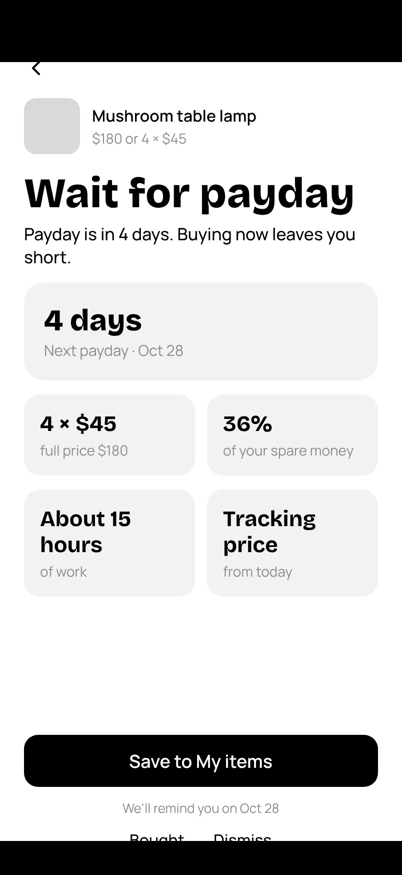
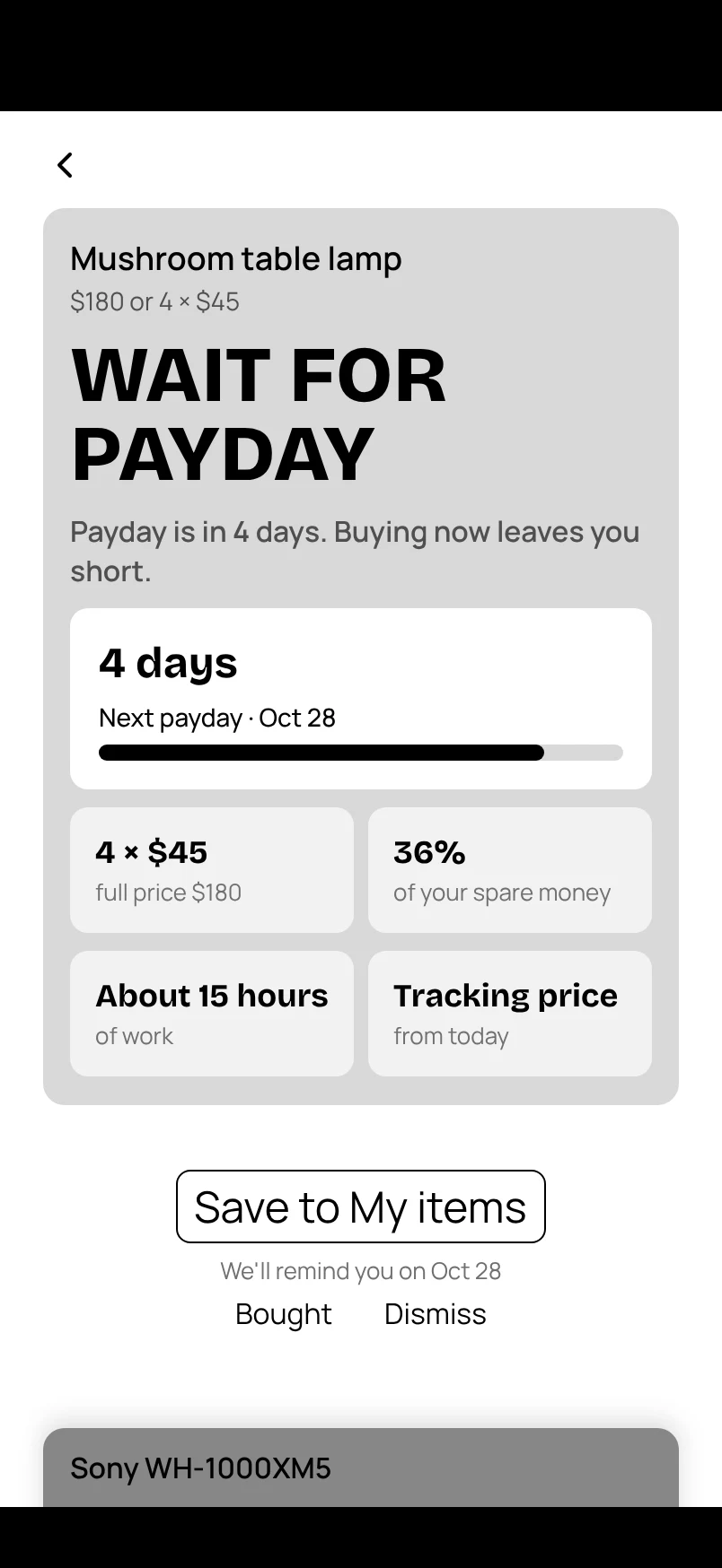
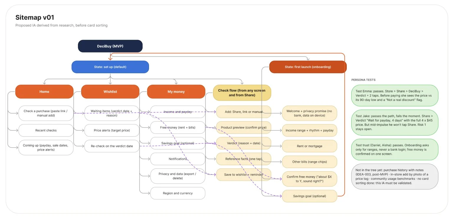
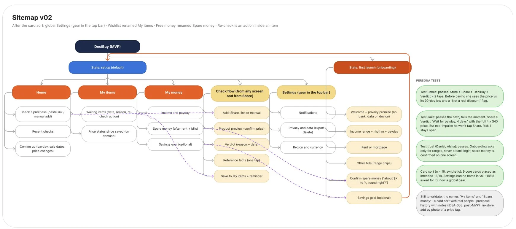
Low-fi v1 was made with AI in Figma: lists, item rows with a square thumbnail, boxed fields. Nothing says this is one item you opened.
EvidenceMy folders
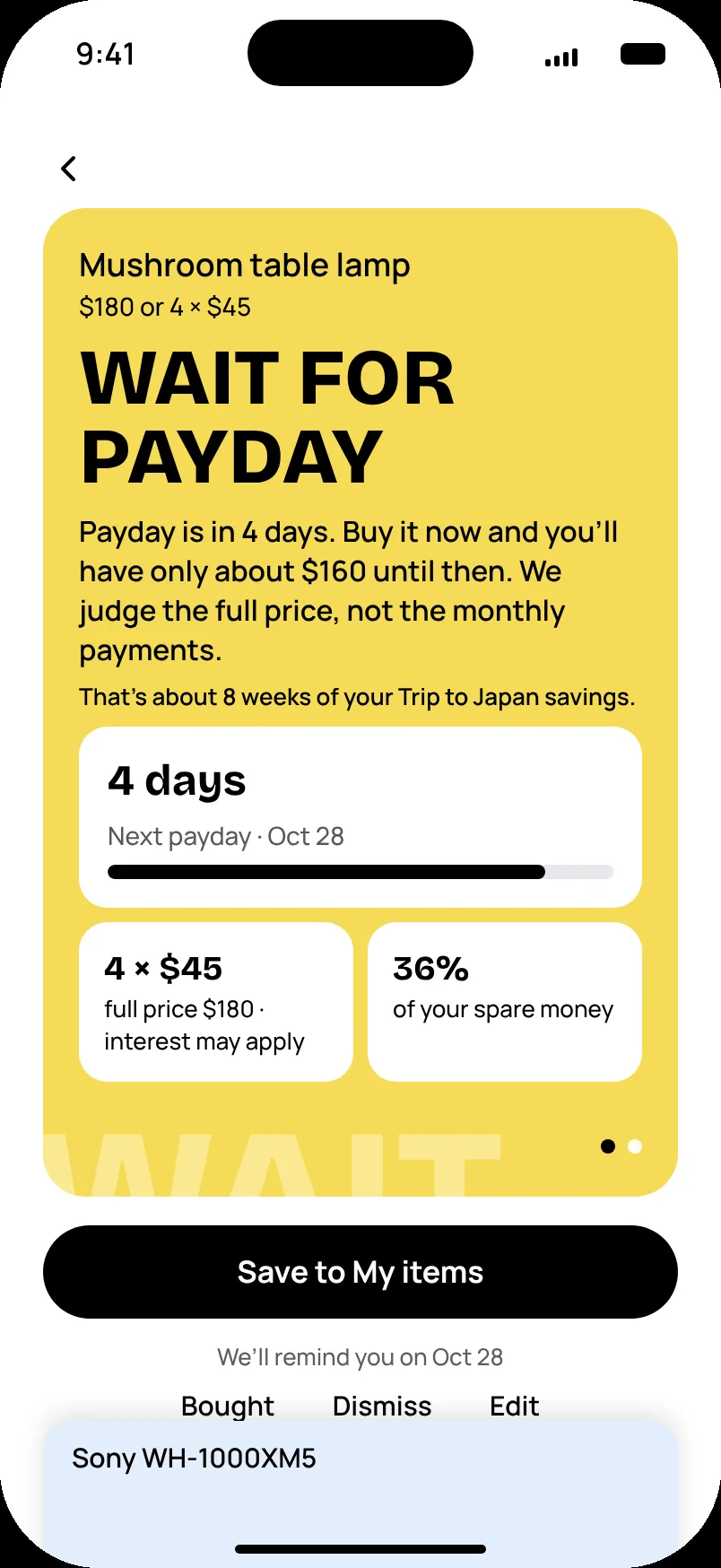
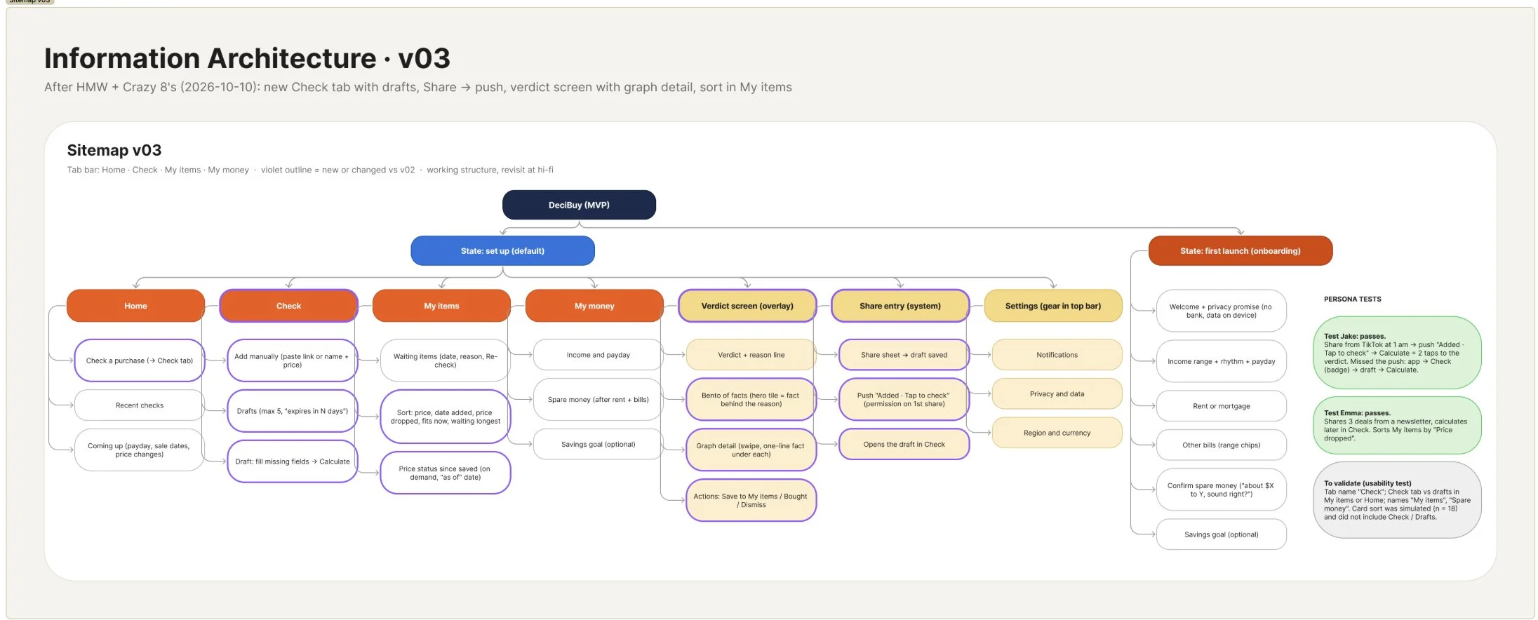
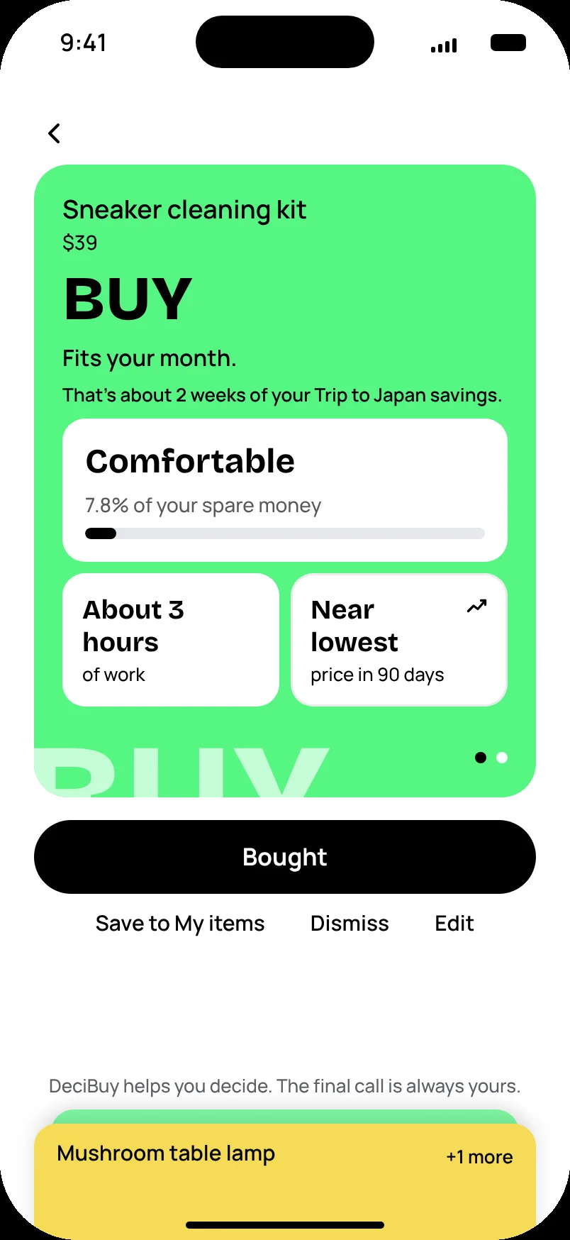
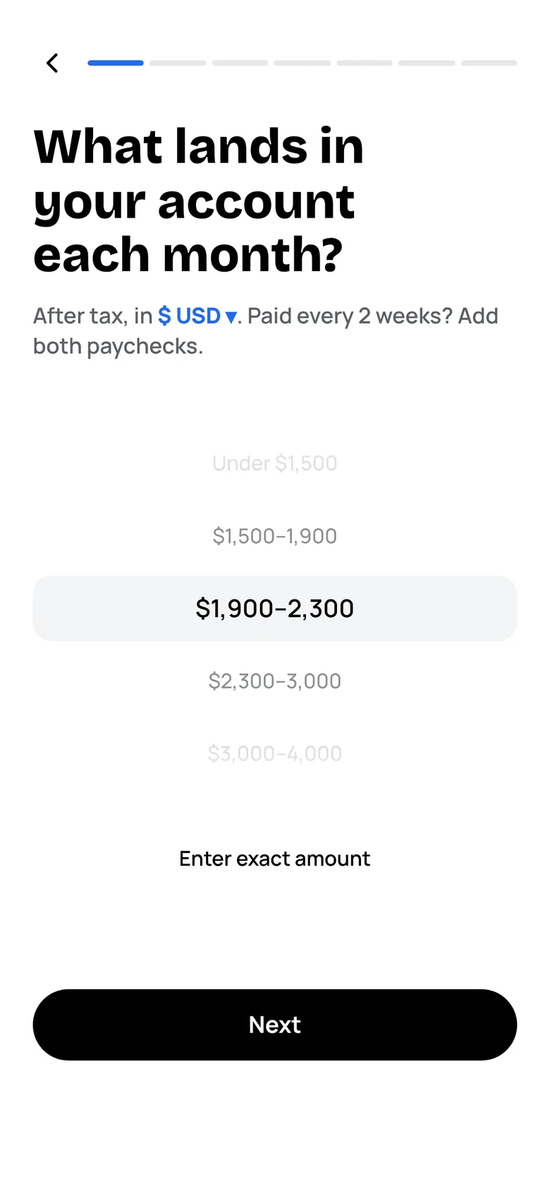
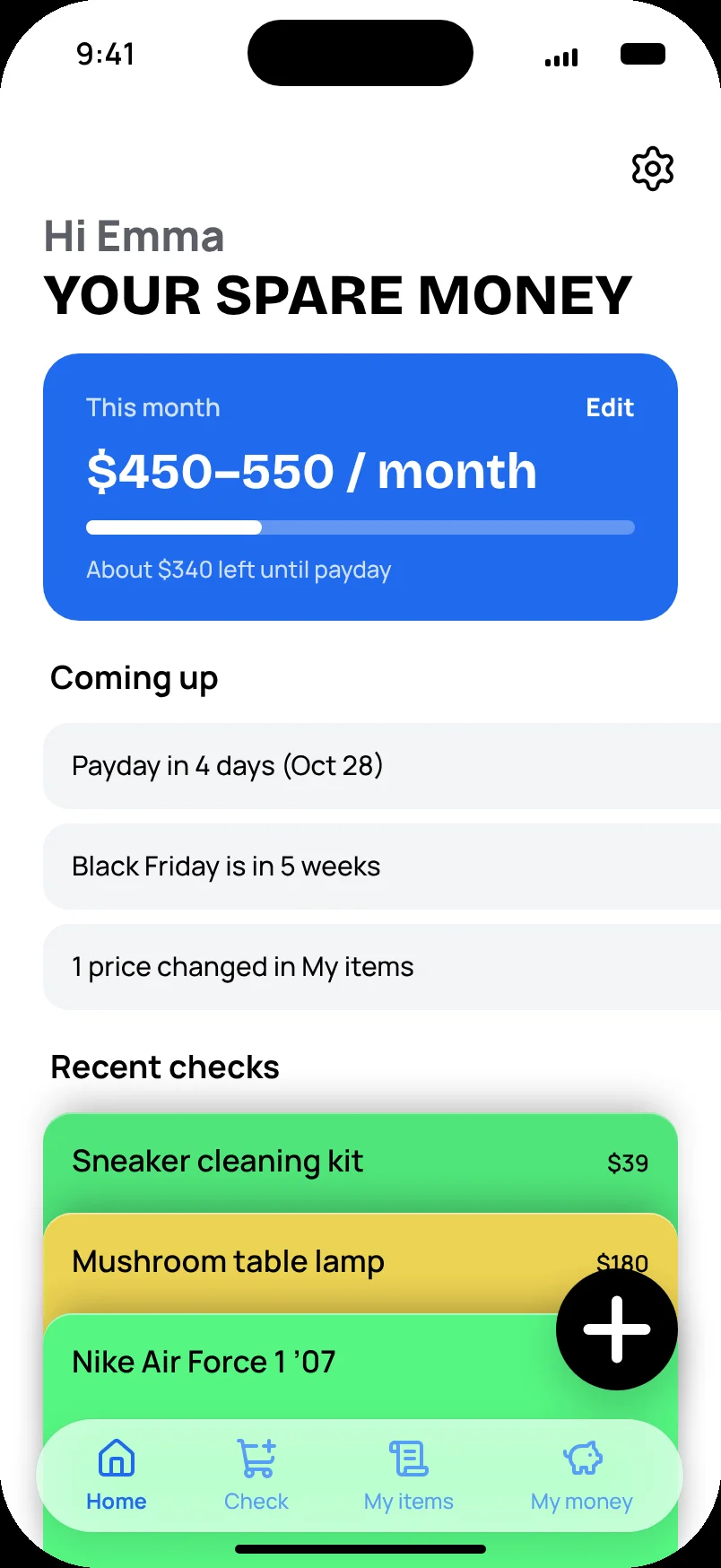
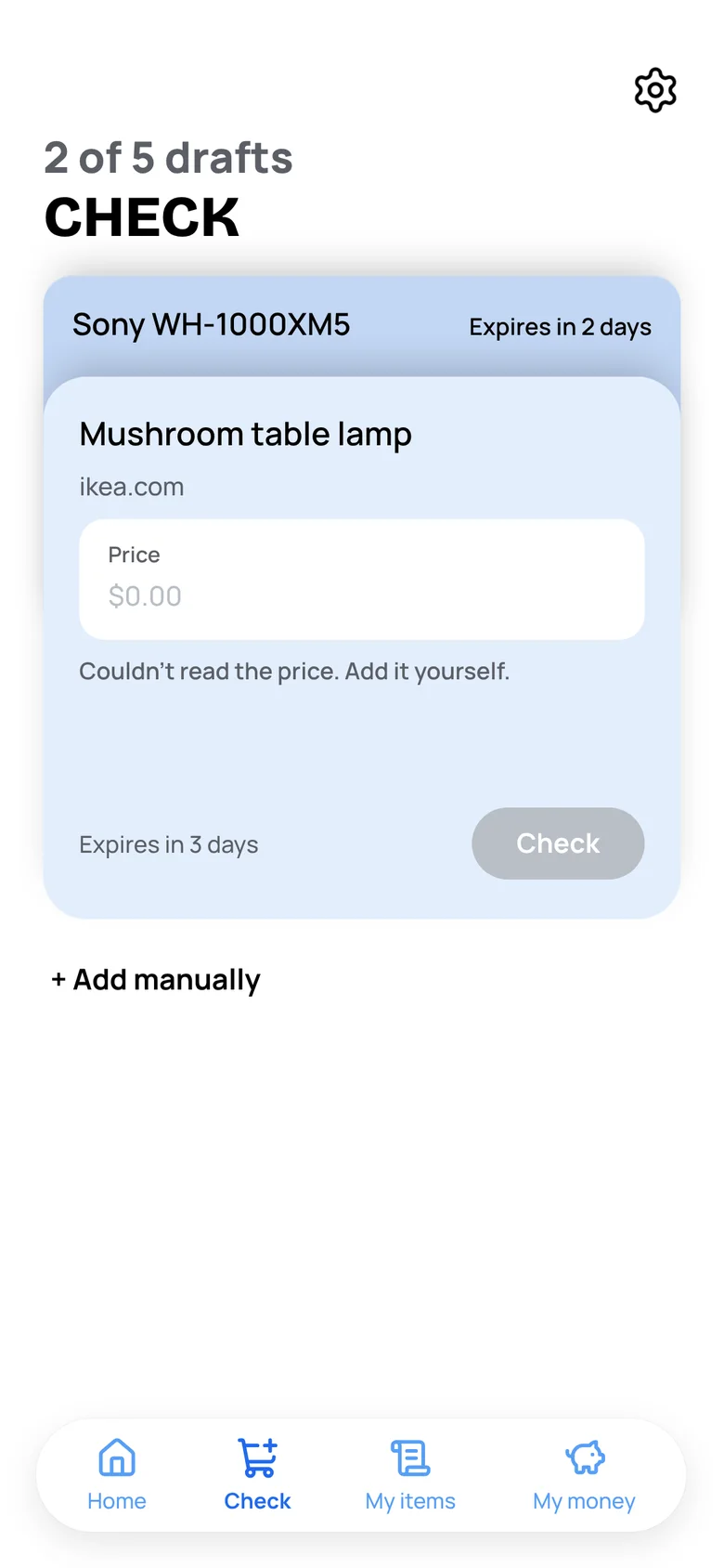
For v2 I redesigned onboarding and Home myself and set one graphic language for the whole app. The verdict is an open folder, and the next item waits below it.
ProductColor is the verdict
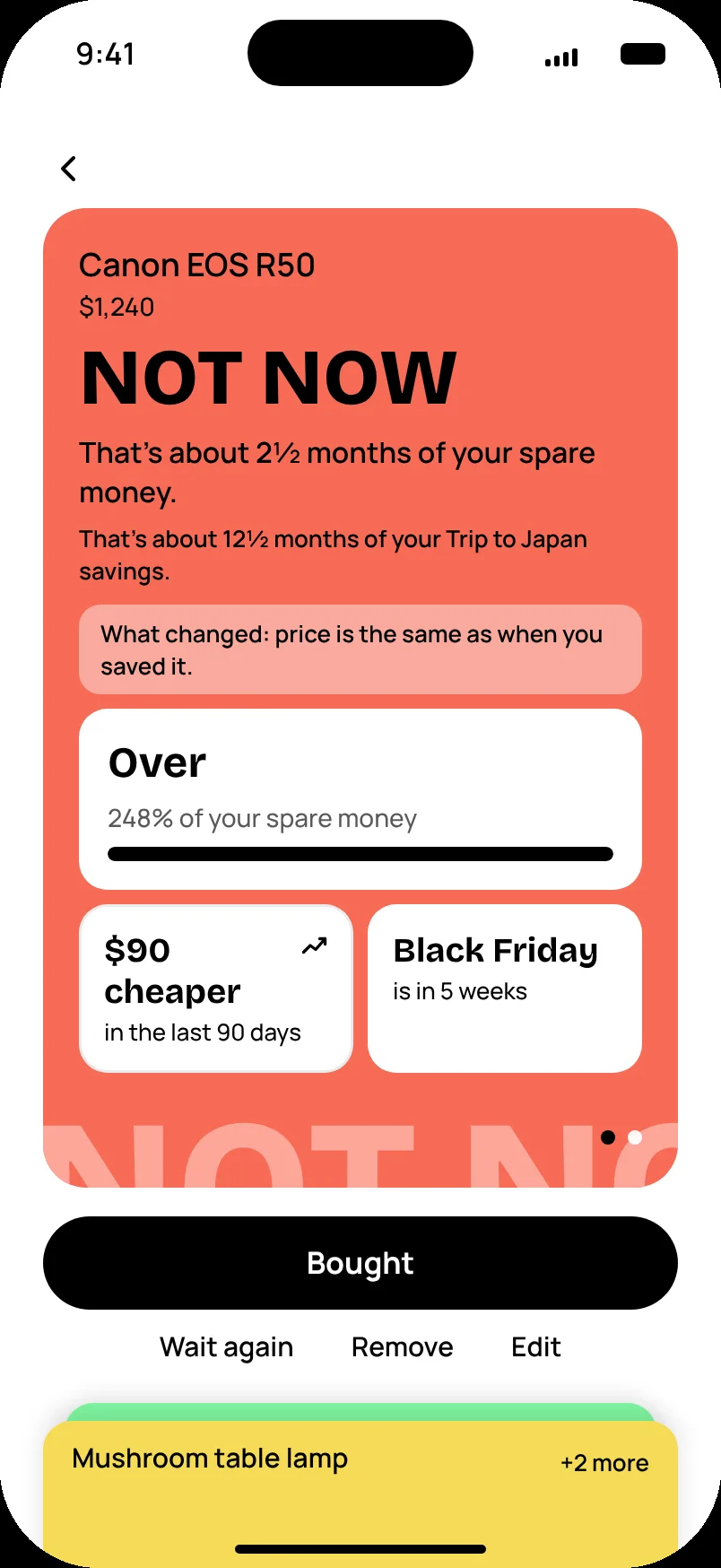
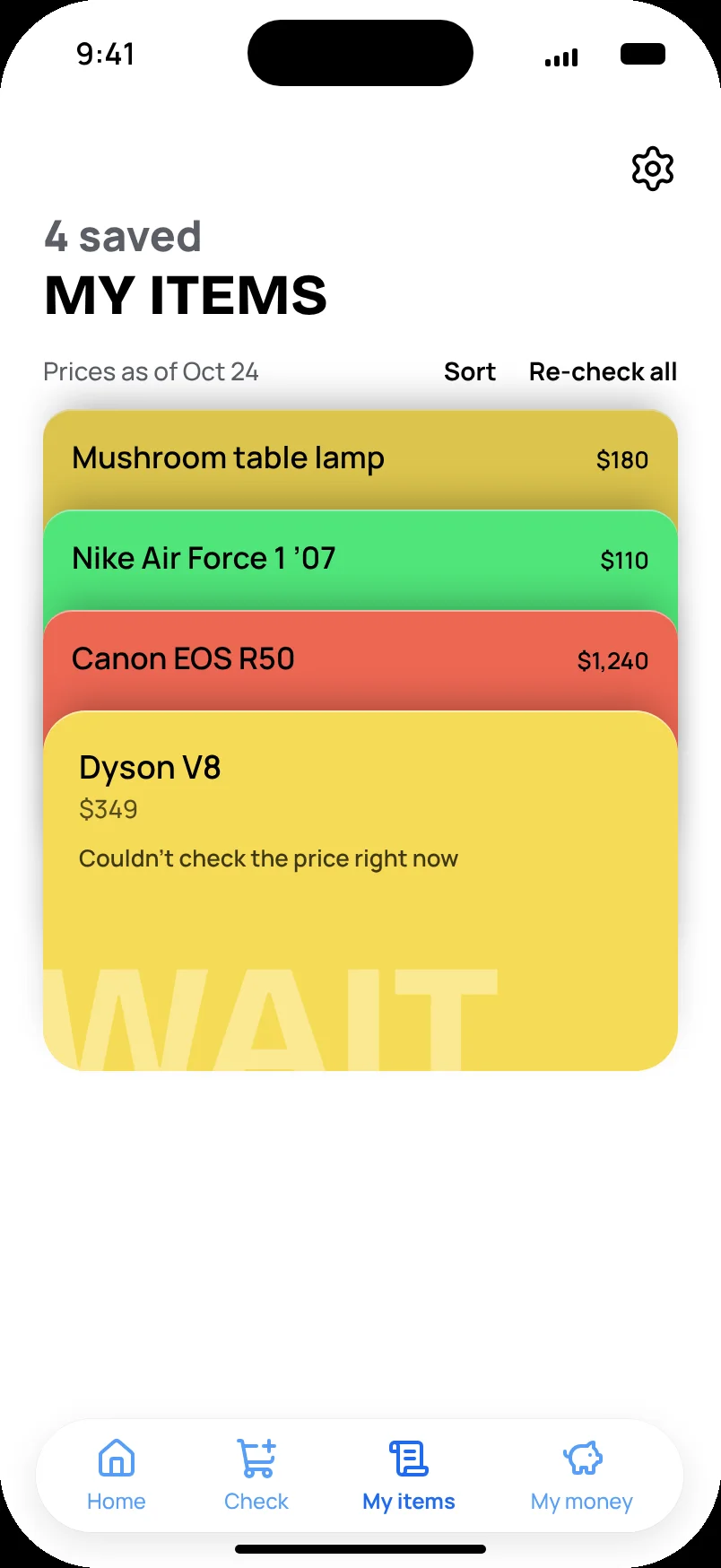
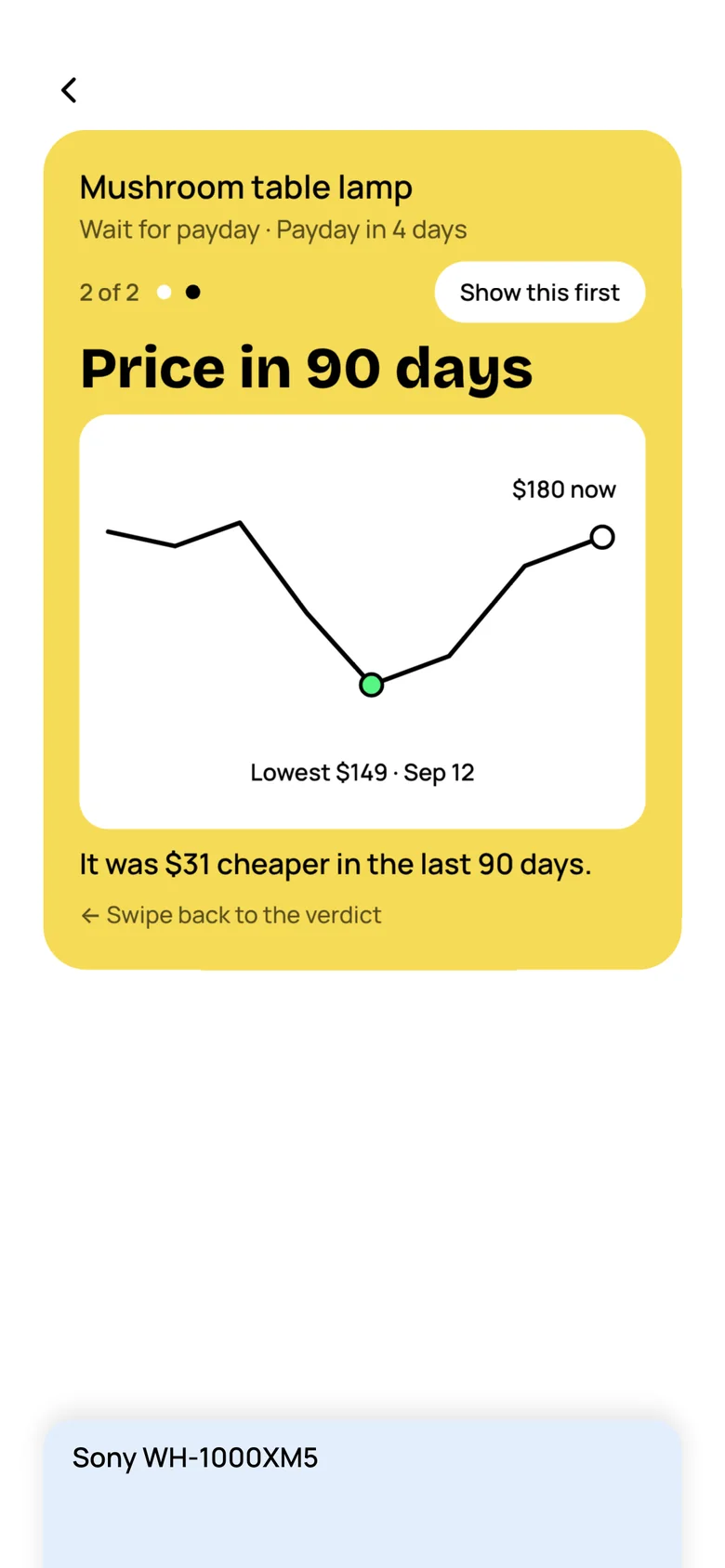
The folder takes the color of its answer, the reason line gives a date and what you’d have left, and the facts sit below in the same order for every answer.
Why folders, not rows. An item opens like a folder and the rest slide down, so you never lose the list. The color is the verdict, so a stack reads without words. The tab shows the price, so you never guess what something costs.
 DeciBuy